/* GREENSTAND, "Roots" design-system case study (bespoke long-form)
   Source: Siddhant's Greenstand / Roots deck. Editorial scroll in the
   portfolio's dark system, emerald accent. Centerpiece: live GSKit gallery. */

const { useEffect: useEffectGS } = React;

const GS = {
  problems: [
    ['Built in silos', 'TreeTracker and TreeTrader were built by separate, rotating volunteer teams, so the two apps never shared a visual language.'],
    ['Duplicated components', 'Multiple versions of the same button, input and card existed across the codebases, each subtly different.'],
    ['Token chaos', '7+ shades of green with no standard neutrals, plus uneven spacing, nothing was systematic.'],
    ['Missing states', 'Hover, focus, and disabled states were absent or inconsistent, so interactions felt broken.'],
    ['Fragmented UX', 'The result was a disjointed experience for users and slower, more error-prone development.'],
  ],
  objectives: [
    ['A unified design system', 'one shared language for both TreeTracker and TreeTrader.'],
    ['150+ reusable components', 'built in Figma, composed only from tokens.'],
    ['Consistent tokens', 'for color, spacing and typography across every surface.'],
    ['WCAG AA accessibility', 'met as a baseline, not an afterthought.'],
    ['A single source of truth', 'for designers and developers across regions.'],
  ],
  audit: [
    ['Buttons', 'Multiple styles and inconsistent states across both apps.'],
    ['Typography', 'Unclear hierarchy, headings and body text lacked a scale.'],
    ['Color', '7+ shades of green and no standard neutral palette.'],
    ['Icons', 'Inconsistent stroke weight, sizing and clarity.'],
    ['Contrast', 'Several screens failed WCAG contrast minimums.'],
    ['Spacing', 'Uneven, ad-hoc spacing with no underlying rhythm.'],
  ],
  greens: ['#2f6b39', '#3a7d44', '#519655', '#1f7a4d', '#4caf7e', '#6cae75', '#86c98f'],
  principles: [
    ['Scalable', 'Atomic structure so the system grows with the product, not against it.', '⬡'],
    ['Accessible', 'WCAG AA baked into every token and component from the first pixel.', '◉'],
    ['Consistent', 'One source of truth, design once, use everywhere.', '⊞'],
    ['Simple', 'Radical clarity for a non-technical, global user base.', '○'],
  ],
  explored: [
    ['Framework foundation', 'Benchmarked Material UI and Adobe Spectrum as the base for Roots.', 'Material gave scalable atomic structure; Spectrum modelled accessibility-first patterns, but neither fit a non-technical, low-bandwidth field user out of the box.', 'Adopted atomic design, adapted for radical simplicity and AA accessibility from the very first token.'],
    ['The primary green', 'Started from the seven-plus greens already living across both apps, Sprout, Chlorophyll and more.', 'Several failed contrast: Sprout, Sunshine and Sunset were unreadable behind small white text.', 'Consolidated to one primary green on a ten-step scale, and moved body text onto Midnight (#222629) for AA.'],
    ['Accent & data colour', 'Tried carrying the bright Sunrise / Sunset oranges through as supporting UI colours.', 'At small sizes they fought the content and undercut the calm, trustworthy tone the apps needed.', 'Demoted them to rare accents, leaned on neutral greys for type, and defined a dedicated data-viz set.'],
    ['Handoff & adoption', 'Shipped the first cut as a Figma library and assumed teams would pull from it.', 'Remote, rotating volunteer devs needed a living, coded reference, static specs weren’t enough.', 'Documented guidelines and integrated the system with Storybook so design and code stayed in sync.'],
  ],
  outcomes: [
    ['150+', 'reusable components shipped in Figma, powering both apps'],
    ['25%', 'reduction in developer rework after adoption'],
    ['AA', 'WCAG compliance across key flows, verified not assumed'],
  ],
  anatomy: [
    ['1', 'Label', 'Display 600 · 14px', 'r'],
    ['2', 'Leading dot / icon slot', 'optional · 8px, inherits text colour'],
    ['3', 'Container fill', 'color/action → green-600', 'r'],
    ['4', 'Corner radius', 'radius/md → 11px'],
    ['5', 'Inset padding', 'space → 15 × 26', 'r'],
  ],
  tokens: [
    ['color/action', 'Container fill', 'green-600 · #1f7a4d'],
    ['color/on-action', 'Label & icon', 'white · #ffffff'],
    ['radius/md', 'Corner radius', '11px'],
    ['space/inset', 'Padding', '15px × 26px'],
    ['type/label', 'Label text', 'Display 600 · 14px'],
    ['focus/ring', 'Focus ring', 'green-200 · 3px'],
  ],
  adoption: [
    ['01', 'Proof before mandate', 'I started as the only designer. Rather than pitch a system in the abstract, I built a handful of core components and dropped them straight into the existing product screens, then showed leadership the before-and-after. Seeing the system working in real designs is what earned the green light to build Roots properly.'],
    ['02', 'A living reference, not static specs', 'Remote, rotating volunteers can’t onboard from a PDF. I paired the Figma library with documented guidelines and a Storybook of coded components, so designers and engineers always pulled from one source of truth that stayed in sync with production.'],
    ['03', 'Governance as it scaled', 'When leadership grew the effort into a team of four, I set the contribution standards, reviewed every new addition, and ran the system like a product, so it stayed coherent and on-brand as more hands began building with it.'],
  ],
  firstRun: [
    ['flow-01-splash.png', '01', 'Splash'],
    ['flow-02-tour1.png', '02', 'Onboarding · impact'],
    ['flow-03-tour2.png', '03', 'Onboarding · wallet'],
    ['flow-04-tour3.png', '04', 'Onboarding · exchange'],
    ['flow-05-signup-empty.png', '05', 'Sign up, empty'],
    ['flow-06-signup-error.png', '06', 'Inline validation'],
    ['flow-07-signup-password.png', '07', 'Password rules'],
    ['flow-08-signup-filled.png', '08', 'Ready to submit'],
    ['flow-09-creating.png', '09', 'Creating account'],
    ['flow-10-welcome.png', '10', 'Account created'],
  ],
  walletFlow: [
    ['app-wallet.png', '01', 'Your wallets'],
    ['wallet-01-empty.png', '02', 'New wallet, empty'],
    ['wallet-02-error.png', '03', 'Unique-name error'],
    ['wallet-03-filled.png', '04', 'Valid & ready'],
    ['wallet-discard.png', '05', 'Discard guardrail'],
    ['wallet-04-created.png', '06', 'Wallet created'],
  ],
  appScreens: [
    ['app-notifications.png', '01', 'Notifications'],
    ['app-settings.png', '02', 'Settings'],
  ],
  learnings: [
    'Scaling a design system beyond a single app is a different discipline than designing one, it lives or dies on adoption.',
    'Collaboration drives adoption. The system spread because teams felt ownership of it, not because it was mandated.',
    'Leading and mentoring designers grew me as much as the work did, the multiplier is people, not pixels.',
  ],
  nextSteps: [
    ['Clearer documentation', 'Build richer docs so new designers and developers can get started faster, with less hand-holding.'],
    ['Automate accessibility', 'Explore automated contrast and a11y checks instead of running them manually each cycle.'],
    ['Web + mobile parity', 'Work even more closely with engineering to bring the system consistently across web and mobile.'],
  ],
};

function ComponentAnatomy() {
  return (
    <div className="gs-anat">
      <div className="gs-anat__top">
        <div className="gs-anat__stage">
          <div className="gs-anat__spec">
            <button className="gsbtn gsbtn--primary gs-anat__btn"><span className="gsbtn__dot" />Plant a tree</button>
            <span className="gs-anat__dot" style={{ top: '-14px', left: '52px', '--len': '0px' }}>1</span>
            <span className="gs-anat__dot" style={{ top: '50%', left: '-30px', transform: 'translateY(-50%)' }}>2</span>
            <span className="gs-anat__dot gs-anat__dot--r" style={{ top: '14px', right: '-30px' }}>3</span>
            <span className="gs-anat__dot gs-anat__dot--r" style={{ bottom: '-14px', right: '34px', '--len': '0px' }}>4</span>
            <span className="gs-anat__dot" style={{ bottom: '6px', left: '-30px' }}>5</span>
          </div>
        </div>
        <ol className="gs-anat__legend">
          {GS.anatomy.map(([n, t, d]) => (
            <li key={n}><span className="n">{n}</span><div><b>{t}</b><p>{d}</p></div></li>
          ))}
        </ol>
      </div>

      <div className="gs-anat__tokens">
        <div className="gs-anat__trow gs-anat__trow--head"><span>Token</span><span>Role</span><span>Value</span></div>
        {GS.tokens.map(([k, r, v]) => (
          <div className="gs-anat__trow" key={k}><span className="gs-anat__tk">{k}</span><span className="gs-anat__tr">{r}</span><span className="gs-anat__tv">{v}</span></div>
        ))}
      </div>

      <div className="gs-anat__dodont">
        <div className="gs-anat__card gs-anat__card--do">
          <span className="gs-anat__k">✓ Do</span>
          <div className="gs-anat__ex"><button className="gsbtn gsbtn--primary">Plant a tree</button><button className="gsbtn gsbtn--secondary">View map</button></div>
          <p className="gs-anat__cap">One primary action per view, paired with a quieter secondary. Hierarchy stays obvious.</p>
        </div>
        <div className="gs-anat__card gs-anat__card--dont">
          <span className="gs-anat__k">✕ Don’t</span>
          <div className="gs-anat__ex"><button className="gsbtn gsbtn--primary">Plant a tree</button><button className="gsbtn gsbtn--primary">View map</button></div>
          <p className="gs-anat__cap">Two primaries compete for attention, the token loses meaning and nothing reads as the main action.</p>
        </div>
      </div>
    </div>
  );
}

function FlowStrip({ steps }) {
  return (
    <div className="gs-flowstrip">
      {steps.map(([src, n, t], i) => (
        <div className="gs-flowstep" key={i}>
          <div className="gs-flowstep__scr"><img src={`assets/greenstand/${src}`} alt={t} loading="lazy" /></div>
          <div className="gs-flowstep__lab"><span className="gs-flowstep__n">{n}</span><span className="gs-flowstep__t">{t}</span></div>
        </div>
      ))}
    </div>
  );
}

function GreenstandCase({ project, projects, onOpen, onHome }) {
  useEffectGS(() => { window.scrollTo(0, 0); }, []);
  const idx = projects.findIndex((x) => x.id === 'greenstand');
  const next = projects[(idx + 1) % projects.length];

  return (
    <article className="case gs">
      <CaseSectionNav sectionSelector=".gs-sec, .gs-band" />
      {/* ---------- HERO ---------- */}
      <section className="case__hero">
        <img className="gs-heromark" src="assets/greenstand/logo.png" alt="" aria-hidden="true" />
        <span className="gs-leaf gs-leaf--d" style={{ width: 84, height: 84, bottom: '16%', right: '24%', transform: 'rotate(-30deg)' }} aria-hidden="true" />
        <div className="wrap">
          <button className="case__back mono" onClick={onHome}>← Back to home</button>
          <div className="gs-brand">
            <img src="assets/greenstand/logo.png" alt="Greenstand logo" />
            <span className="gs-brand__name">Greenstand</span>
          </div>
          <div className="case__metatop">
            <span className="pixel case__no" style={{ color: 'var(--gs-400)' }}>01</span>
            <span className="chip" style={{ borderColor: 'var(--gs-500)', color: 'var(--gs-400)' }}>Design System</span>
            <span className="mono">2025</span>
          </div>
          <h1 className="case__title display">Greenstand</h1>
          <p className="case__subtitle">Roots, a design system for global tree-tracking</p>
          <p className="case__blurb">I joined a climate nonprofit to unify two siloed apps into one accessible, scalable design language. I built <strong>Roots</strong> from scratch as the only designer, and it grew into a formal program with a team of four that I led to ship it into production.</p>
          <div className="case__meta">
            {[['Role', 'Lead UX Designer'], ['Ownership', 'Solo build → led team of 4'], ['Scope', '150+ components · tokens · a11y'], ['Tools', 'Figma · Storybook · WCAG']].map(([k, v]) => (
              <div className="case__metacell" key={k}>
                <span className="mono case__metak">{k}</span>
                <span className="case__metav">{v}</span>
              </div>
            ))}
          </div>
        </div>
      </section>

      {/* ---------- HERO SHOWCASE: live system at a glance ---------- */}
      <section className="wrap">
        <GSKit />
        <span className="gs-shotcap">Roots, rendered live, switch tabs to explore foundations, components and states. Every element here is a real system component.</span>
      </section>

      {/* ---------- CONTEXT ---------- */}
      <section className="wrap gs-sec">
        <div className="gs-sec__label"><span className="pixel" style={{ color: 'var(--gs-400)' }}>00</span><span className="mono">The context</span></div>
        <div className="gs-sec__body">
          <h2 className="gs-h2">Tech that fights climate change, held back by its own UI</h2>
          <p className="gs-lead">Greenstand is a nonprofit building technology to fight climate change through verified tree planting. Its two flagship apps, <strong>TreeTracker</strong> for field mappers and <strong>TreeTrader</strong> for the tree-credit marketplace, serve a primary user base across Africa and Europe. I was brought in to lead a design-system initiative to unify the apps and set them up for global scale.</p>
          <div className="gs-role">
            <div className="gs-role__cell">
              <span className="gs-role__k mono">What I led</span>
              <p className="gs-role__v">I launched <strong>Roots as a solo initiative</strong>, defined every token, built 150+ components, and wrote the system documentation in Figma. As it proved out, leadership scaled it into a formal program and I <strong>managed and mentored a team of four designers</strong>.</p>
            </div>
            <div className="gs-role__cell">
              <span className="gs-role__k mono">Who I worked with</span>
              <p className="gs-role__v">Leadership on priorities and adoption, <strong>global volunteer teams</strong> across Africa and Europe, and developers, to integrate the system directly into the production apps.</p>
            </div>
          </div>
          <p className="gs-lead gs-lead--sm" style={{ marginTop: 'clamp(20px,2.4vw,30px)' }}>I designed around real constraints: a <strong>volunteer-driven org</strong> where the system had to earn adoption rather than mandate it, <strong>remote async collaboration</strong> across three continents, and <strong>live codebases</strong> I had to design around, for a <strong>non-technical user base</strong> that needed radical simplicity.</p>
        </div>
      </section>

      {/* ---------- PROBLEM ---------- */}
      <section className="wrap gs-sec">
        <div className="gs-sec__label"><span className="pixel" style={{ color: 'var(--gs-400)' }}>01</span><span className="mono">The problem</span></div>
        <div className="gs-sec__body">
          <h2 className="gs-h2">Two apps, built in silos, drifting apart</h2>
          <p className="gs-lead">TreeTracker and TreeTrader had been built independently by rotating volunteers. The result was a fragmented experience and slow, duplicative development.</p>
          <div className="gs-cards">
            {GS.problems.map(([t, d], i) => (
              <Reveal key={i} className="gs-card" delay={`d${(i % 3) + 1}`}>
                <span className="gs-card__no mono">0{i + 1}</span>
                <h3 className="gs-card__t">{t}</h3>
                <p className="gs-card__d">{d}</p>
              </Reveal>
            ))}
          </div>

          <h3 className="gs-h3">The clearest symptom: 7+ greens, no system</h3>
          <p className="gs-lead gs-lead--sm">
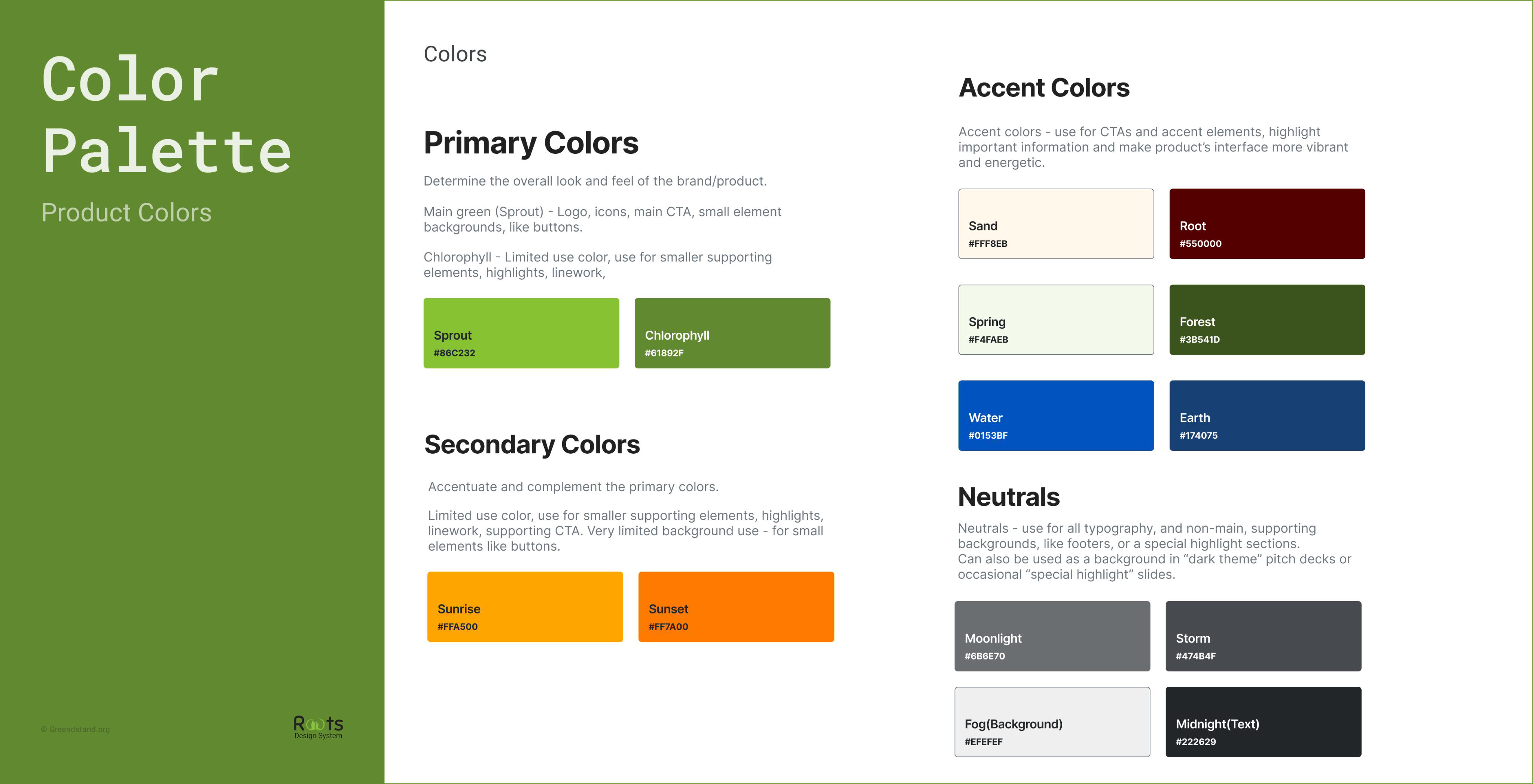
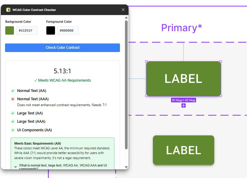
A brand built on trees had no agreed green. I found seven-plus shades in use across the two apps, none of them documented, several failing contrast.</p>
          <div className="gs-greens">
            {GS.greens.map((g, i) => (
              <span key={i} className="gs-greens__sw" style={{ background: g }}>{g}</span>
            ))}
          </div>

          <div className="gs-figrow2">
            <div>
              <span className="gs-ba__tag gs-ba__tag--before"><span className="gs-ba__dot" />TreeTracker, login, before</span>
              <div className="gs-fig gs-fig--phone"><img src="assets/greenstand/before-treetracker.png" alt="TreeTracker login screen before the redesign" loading="lazy" /></div>
            </div>
            <div>
              <span className="gs-ba__tag gs-ba__tag--before"><span className="gs-ba__dot" />TreeTrader, login, before</span>
              <div className="gs-fig gs-fig--phone gs-fig--dark"><img src="assets/greenstand/before-treetrader.png" alt="TreeTrader login screen before the redesign" loading="lazy" /></div>
            </div>
          </div>
          <span className="gs-figcap">Two products, two unrelated login screens, different inputs, buttons, colours and states. The same job, designed twice.</span>
        </div>
      </section>

      {/* ---------- OBJECTIVE ---------- */}
      <section className="gs-band">
        <span className="gs-leaf" style={{ width: 160, height: 160, top: '-8%', left: '4%', transform: 'rotate(-20deg)', opacity: .18 }} aria-hidden="true" />
        <span className="gs-leaf gs-leaf--d" style={{ width: 96, height: 96, bottom: '8%', right: '7%', transform: 'rotate(28deg)' }} aria-hidden="true" />
        <div className="wrap">
          <span className="mono mono--green">( The objective )</span>
          <p className="gs-statement">Establish a <em>unified design system</em>, a single source of truth that makes both apps consistent, <em>accessible</em>, and ready to <em>scale globally</em>.</p>
          <div className="gs-objs">
            {GS.objectives.map(([t, d], i) => (
              <div className="gs-obj" key={i}>
                <span className="gs-obj__tick">✳</span>
                <span className="gs-obj__t"><strong>{t}</strong>, {d}</span>
              </div>
            ))}
          </div>
        </div>
      </section>

      {/* ---------- OWNERSHIP ARC ---------- */}
      <section className="wrap gs-sec">
        <div className="gs-sec__label"><span className="pixel" style={{ color: 'var(--gs-400)' }}>02</span><span className="mono">Ownership</span></div>
        <div className="gs-sec__body">
          <h2 className="gs-h2">From a one-person experiment to a program I led</h2>
          <p className="gs-lead">The most meaningful part of this project wasn’t the components, it was the trajectory. I started alone and earned the mandate to lead.</p>
          <div className="gs-arc">
            <Reveal className="gs-arc__step" delay="d1">
              <span className="gs-arc__n">Phase 01</span>
              <h3 className="gs-arc__t">Built it solo</h3>
              <p className="gs-arc__d">I created Roots from scratch as the only designer, tokens, 150+ components and documentation, and implemented it directly in the apps.</p>
            </Reveal>
            <Reveal className="gs-arc__step" delay="d2">
              <span className="gs-arc__n">Phase 02</span>
              <h3 className="gs-arc__t">Earned the mandate</h3>
              <p className="gs-arc__d">Leadership saw the impact and scaled Roots into a formal program, and asked me to lead it. Before I knew it I had a team of four.</p>
            </Reveal>
            <Reveal className="gs-arc__step" delay="d3">
              <span className="gs-arc__n">Phase 03</span>
              <h3 className="gs-arc__t">Led it to production</h3>
              <p className="gs-arc__d">I mentored the team, deployed the system, and every software-engineering team adopted it, lifting user retention and cutting development time.</p>
            </Reveal>
          </div>
        </div>
      </section>

      {/* ---------- UNDERSTAND ---------- */}
      <section className="wrap gs-sec">
        <div className="gs-sec__label"><span className="pixel" style={{ color: 'var(--gs-400)' }}>03</span><span className="mono">Understand</span></div>
        <div className="gs-sec__body">
          <h2 className="gs-h2">
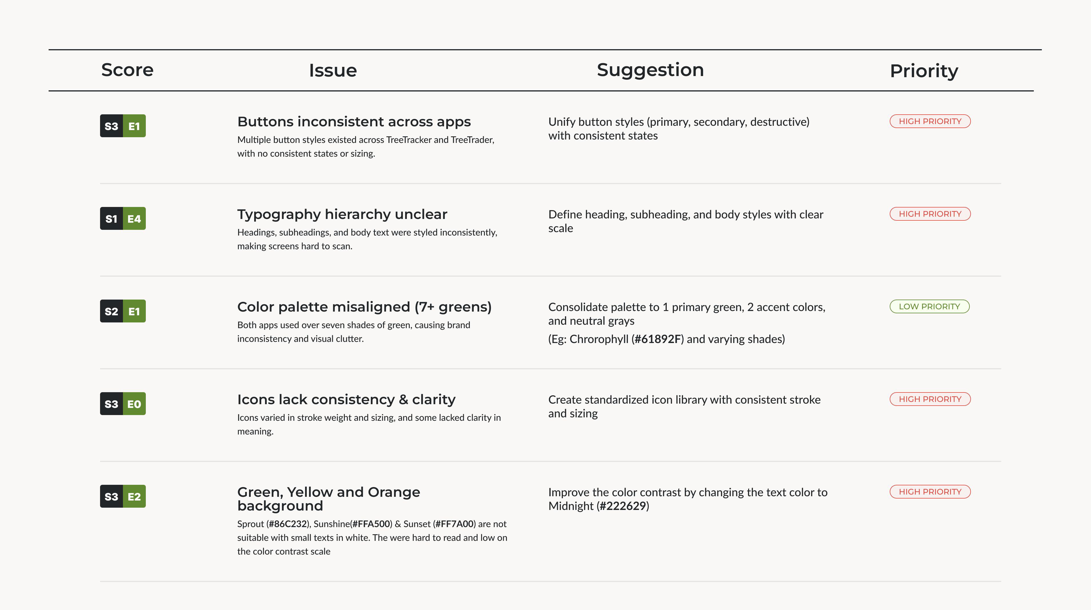
A full audit, before a single new pixel</h2>
          <p className="gs-lead">I inventoried both apps end to end, cataloging every component and token in use, then ranked the problems by severity and how cheaply they could be fixed.</p>
          <h3 className="gs-h3">Key findings from the UX audit</h3>
          <div className="gs-audit">
            {GS.audit.map(([k, t], i) => (
              <div className="gs-audit__cell" key={i}>
                <span className="gs-audit__k">{k}</span>
                <span className="gs-audit__t">{t}</span>
              </div>
            ))}
          </div>
          <div className="gs-figwide">
            <span className="gs-ba__tag gs-ba__tag--before"><span className="gs-ba__dot" />Prioritised audit, scored by severity &amp; effort</span>
            <div className="gs-fig"><img src="assets/greenstand/audit-table.png" alt="Audit table scoring each issue by severity and effort, with a suggestion and priority for buttons, typography, colour, icons and contrast" loading="lazy" /></div>
          </div>
        </div>
      </section>

      {/* ---------- EXPLORE ---------- */}
      <section className="wrap gs-sec">
        <div className="gs-sec__label"><span className="pixel" style={{ color: 'var(--gs-400)' }}>04</span><span className="mono">Explore</span></div>
        <div className="gs-sec__body">
          <h2 className="gs-h2">Learn from the best, then commit to principles</h2>
          <p className="gs-lead">I studied <strong>Material UI</strong> for its atomic structure and <strong>Adobe Spectrum</strong> for accessibility-first patterns, then distilled four principles to guide every decision in Roots.</p>
          <div className="gs-figwide" style={{ marginBottom: 'clamp(28px,4vw,44px)' }}>
            <span className="gs-ba__tag gs-ba__tag--before"><span className="gs-ba__dot" />Reference, Material UI typography & component anatomy</span>
            <div className="gs-fig"><img src="assets/greenstand/research-mui.png" alt="Material UI typography variants studied as a reference for atomic structure" loading="lazy" /></div>
          </div>
          <div className="gs-princ">
            {GS.principles.map(([t, d, ico], i) => (
              <Reveal key={i} className="gs-princ__card" delay={`d${(i % 2) + 1}`}>
                <span className="gs-princ__ico">{ico}</span>
                <h3 className="gs-princ__t">{t}</h3>
                <p className="gs-princ__d">{d}</p>
              </Reveal>
            ))}
          </div>

          <h3 className="gs-h3">Component explorations</h3>
          <p className="gs-lead gs-lead--sm">I explored multiple variations of buttons, inputs and cards, comparing states, hierarchy and scalability across both apps, then narrowed to unified patterns built for consistency and reuse.</p>
          <div className="gs-figrow2">
            <div>
              <span className="gs-ba__tag gs-ba__tag--before"><span className="gs-ba__dot" />Early button variants, mapped across states</span>
              <div className="gs-fig gs-fig--dark"><img src="assets/greenstand/buttons-states.png" alt="Early button variants mapped across primary, secondary, link and FAB, each with inactive, hover, disabled and focused states" loading="lazy" /></div>
            </div>
            <div>
              <span className="gs-ba__tag gs-ba__tag--before"><span className="gs-ba__dot" />Input field, every state explored</span>
              <div className="gs-fig"><img src="assets/greenstand/input-states.png" alt="Input with icon explored across inactive, focused, validation, error, loading and success states" loading="lazy" /></div>
            </div>
          </div>

          <h3 className="gs-h3">What I explored, and what I ruled out</h3>
          <p className="gs-lead gs-lead--sm">A system is the sum of its dead-ends as much as its decisions. A few of the bigger forks, and where each one landed.</p>
          <div className="gs-explore">
            {GS.explored.map(([t, tr, le, de], i) => (
              <div className="gs-tld" key={i}>
                <div className="gs-tld__h"><span className="gs-tld__no">0{i + 1}</span><span className="gs-tld__t">{t}</span></div>
                <div className="gs-tld__seg"><span className="gs-tld__k gs-tld__k--tried">Tried</span><p>{tr}</p></div>
                <div className="gs-tld__seg"><span className="gs-tld__k gs-tld__k--learned">Learned</span><p>{le}</p></div>
                <div className="gs-tld__seg"><span className="gs-tld__k gs-tld__k--decided">Decided</span><p>{de}</p></div>
              </div>
            ))}
          </div>
        </div>
      </section>

      {/* ---------- EXECUTION ---------- */}
      <section className="wrap gs-sec">
        <div className="gs-sec__label"><span className="pixel" style={{ color: 'var(--gs-400)' }}>05</span><span className="mono">Execution</span></div>
        <div className="gs-sec__body">
          <h2 className="gs-h2">The system, built and documented</h2>
          <p className="gs-lead">
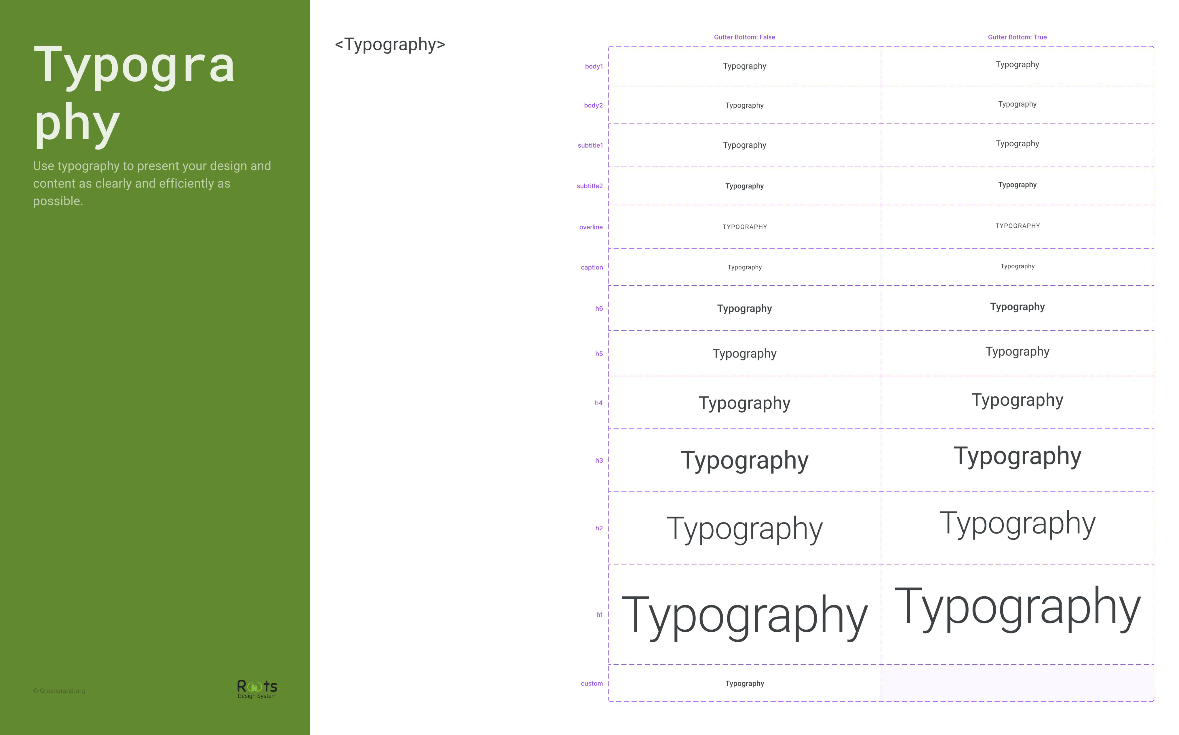
Roots shipped as a token-driven Figma library plus a Storybook of coded components, foundations first, components composed only from tokens, every state and contrast ratio accounted for. Here it is, live:</p>
          <div style={{ marginTop: 'clamp(20px,3vw,32px)' }}>
            <GSKit />
          </div>
          <div className="gs-figrow2" style={{ marginTop: 'clamp(28px,3.5vw,44px)' }}>
            <div>
              <span className="gs-ba__tag gs-ba__tag--after"><span className="gs-ba__dot" />Colour palette, one system</span>
              <div className="gs-fig"><img src="assets/greenstand/foundations-color.png" alt="Roots color palette: primary, secondary, accent and neutral tokens with hex values" loading="lazy" /></div>
            </div>
            <div>
              <span className="gs-ba__tag gs-ba__tag--after"><span className="gs-ba__dot" />Type scale, clear hierarchy</span>
              <div className="gs-fig"><img src="assets/greenstand/foundations-type.png" alt="Roots typography scale from body to display" loading="lazy" /></div>
            </div>
          </div>
          <div className="gs-figwide">
            <span className="gs-ba__tag gs-ba__tag--after"><span className="gs-ba__dot" />150+ button variants, every type × every state</span>
            <div className="gs-fig"><img src="assets/greenstand/buttons-matrix.png" alt="The unified button system: primary, secondary, error, warning, info and inherit variants across enabled, hovered, focused, disabled and loading states" loading="lazy" /></div>
          </div>

          <h3 className="gs-h3">
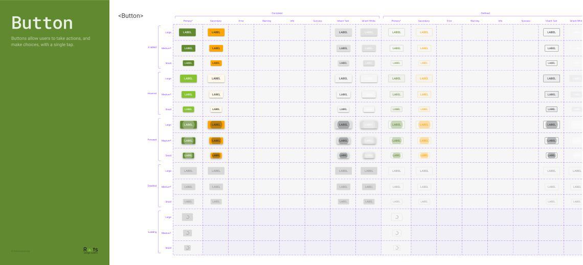
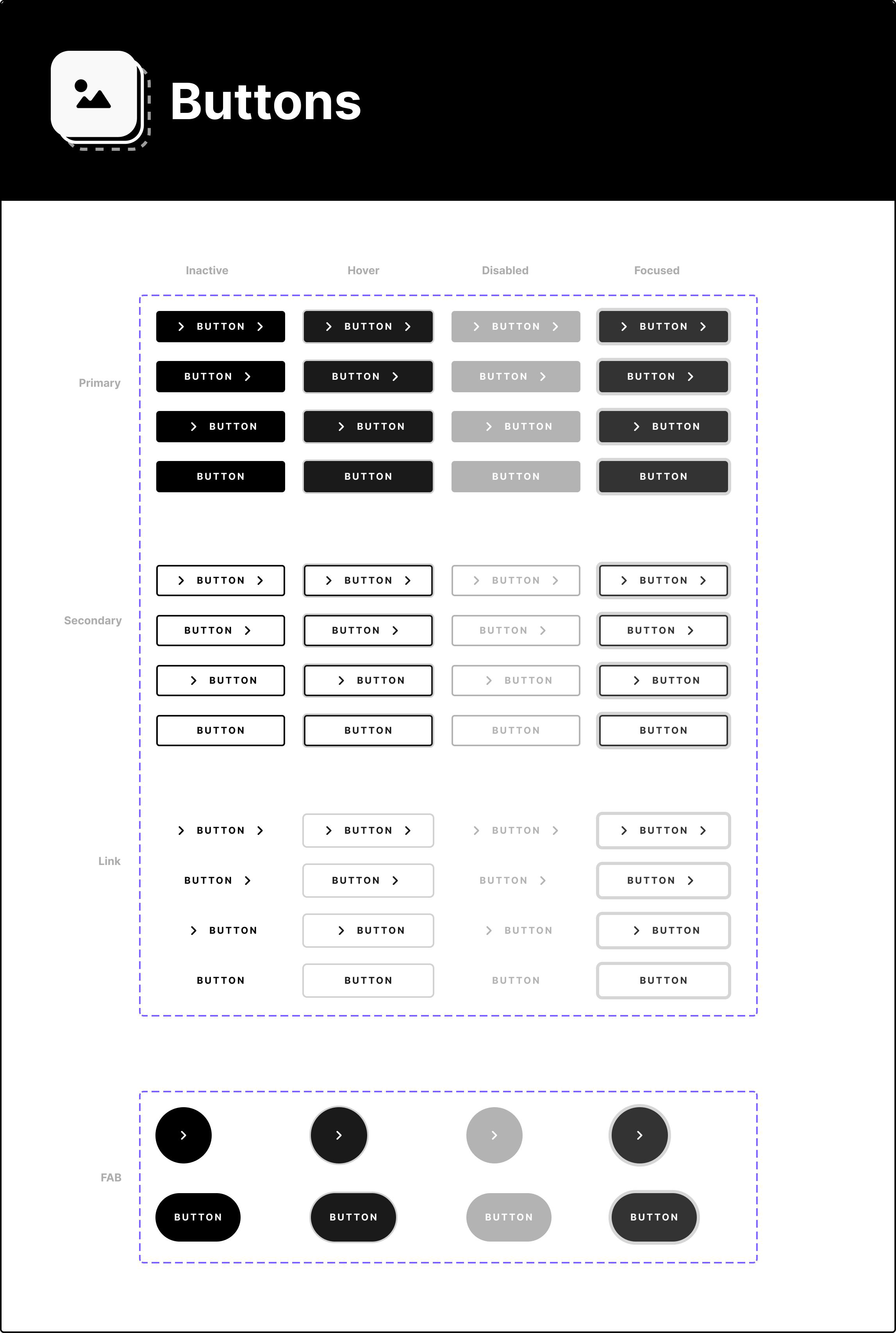
Anatomy of a component</h3>
          <p className="gs-lead gs-lead--sm">A system is only as strong as its documentation. Here's the primary button the way Roots publishes every component, anatomy, the tokens behind it, and the usage rules engineers build from. This is the real component, not a picture of one.</p>
          <ComponentAnatomy />
          <div className="gs-figrow2">
            <div>
              <span className="gs-ba__tag gs-ba__tag--after"><span className="gs-ba__dot" />Built &amp; documented in Figma</span>
              <div className="gs-fig"><img src="assets/greenstand/figma-file.png" alt="The Roots Design System 1.0 Figma file, with component and color styles" loading="lazy" /></div>
            </div>
            <div>
              <span className="gs-ba__tag gs-ba__tag--after"><span className="gs-ba__dot" />Accessibility, verified, 5.13:1 AA</span>
              <div className="gs-fig"><img src="assets/greenstand/a11y-contrast.png" alt="WCAG color contrast checker confirming the primary green passes AA at 5.13 to 1" loading="lazy" /></div>
            </div>
          </div>
        </div>
      </section>

      {/* ---------- IN ACTION ---------- */}
      <section className="wrap gs-sec">
        <div className="gs-sec__label"><span className="pixel" style={{ color: 'var(--gs-400)' }}>06</span><span className="mono">Roots in action</span></div>
        <div className="gs-sec__body">
          <h2 className="gs-h2">From design system to shipped screens</h2>
          <p className="gs-lead">The unified components went straight into TreeTracker and TreeTrader, improving consistency, reducing developer rework, and giving non-technical growers a clearer, calmer experience.</p>

          <h3 className="gs-h3">
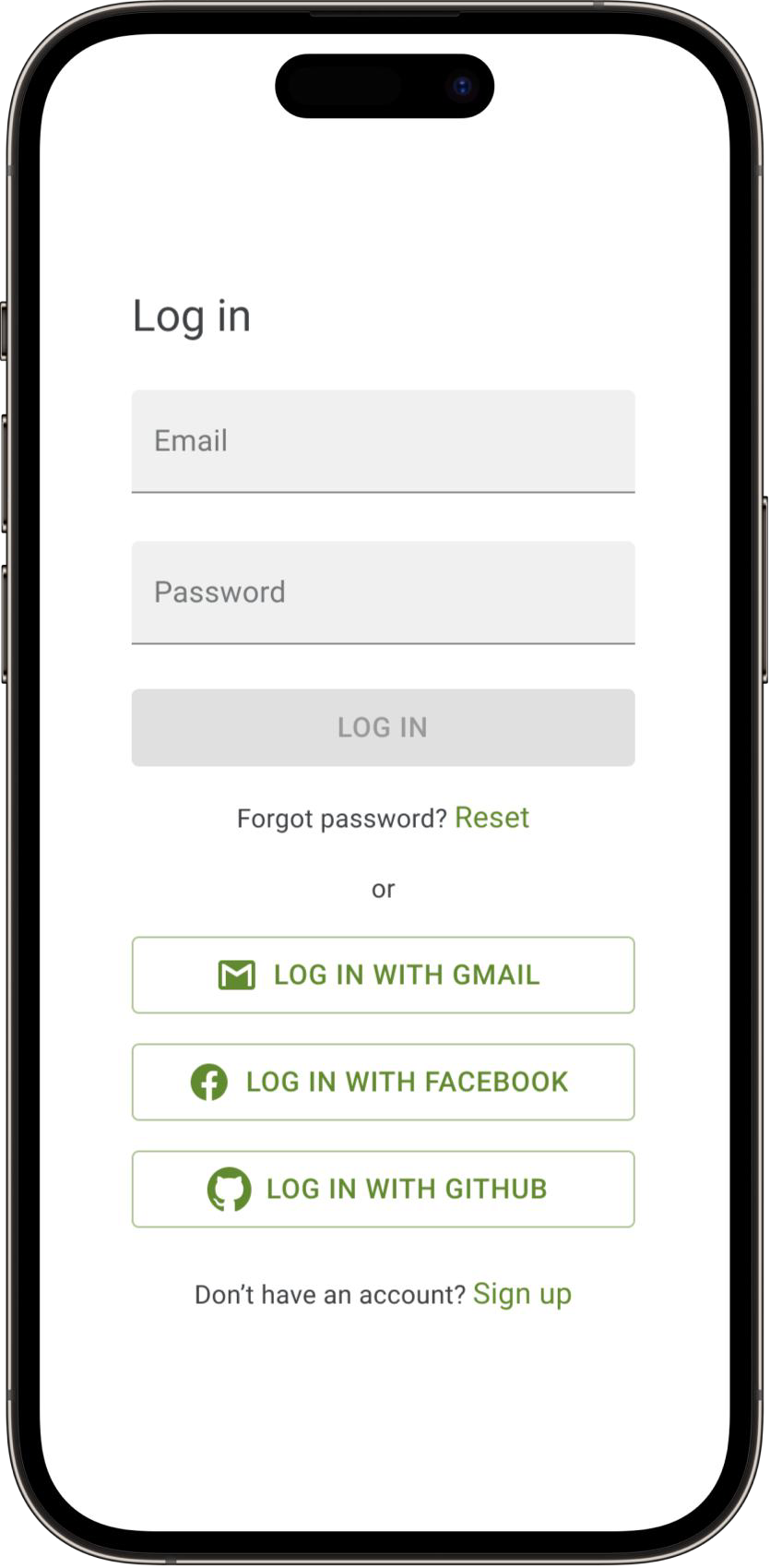
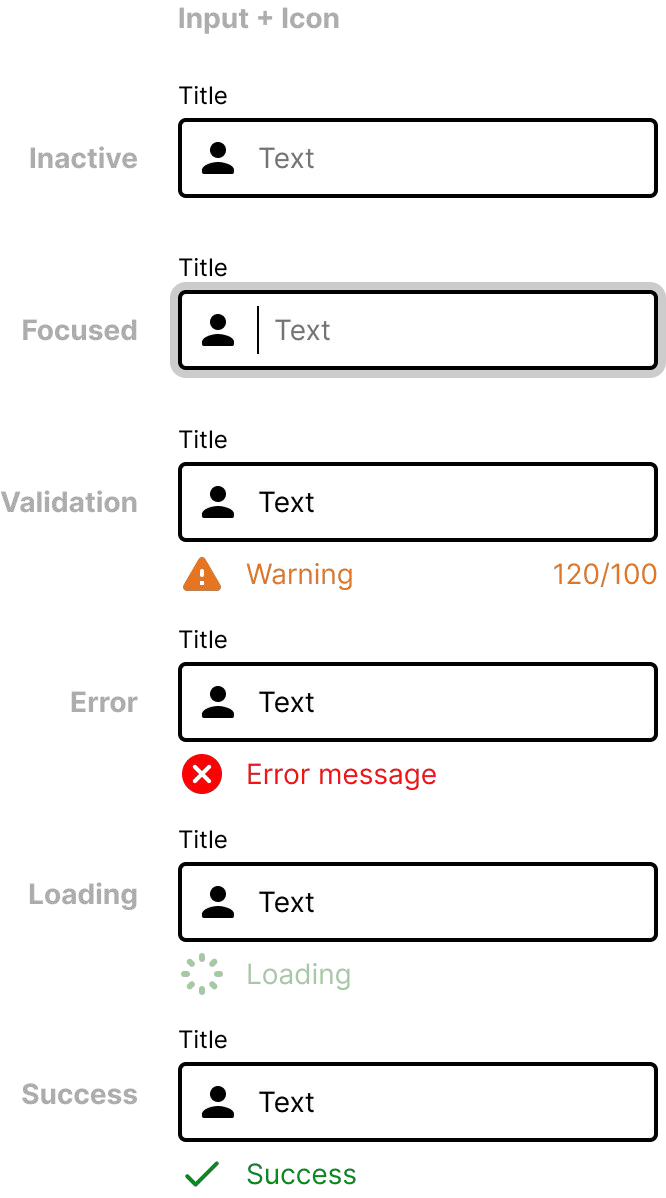
A new user's first run</h3>
          <p className="gs-lead gs-lead--sm">Splash to onboarding to a validated sign-up, including the empty, error, focus and loading states. One input and one button component carry the entire flow. Scroll the strip →</p>
          <FlowStrip steps={GS.firstRun} />

          <h3 className="gs-h3">
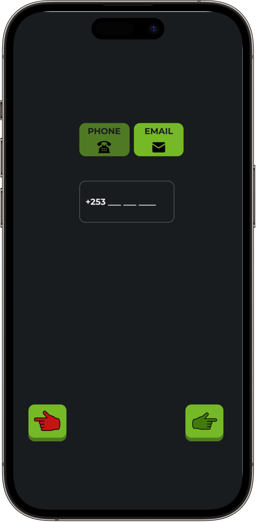
Create a wallet, end to end</h3>
          <p className="gs-lead gs-lead--sm">The same components compose a second flow, with inline validation, a discard guardrail and a success state, all from the system. Scroll the strip →</p>
          <FlowStrip steps={GS.walletFlow} />
        </div>
      </section>

      {/* ---------- ADOPTION & GOVERNANCE ---------- */}
      <section className="wrap gs-sec">
        <div className="gs-sec__label"><span className="pixel" style={{ color: 'var(--gs-400)' }}>07</span><span className="mono">Adoption</span></div>
        <div className="gs-sec__body">
          <h2 className="gs-h2">A system is only real once people use it</h2>
          <p className="gs-lead">Roots didn't spread because it was mandated, it spread because I proved it, made it effortless to pull from, and governed it as it grew. That's the difference between a component file and a design system.</p>
          <div className="gs-adopt">
            {GS.adoption.map(([n, t, d], i) => (
              <Reveal key={i} className="gs-adopt__row" delay={`d${(i % 3) + 1}`}>
                <span className="gs-adopt__n">{n}</span>
                <div>
                  <h3 className="gs-adopt__t">{t}</h3>
                  <p className="gs-adopt__d">{d}</p>
                </div>
              </Reveal>
            ))}
          </div>

          <div className="gs-proof">
            <span className="gs-proof__n">Days, not weeks</span>
            <p className="gs-proof__t">The real test came when a new UX designer joined. Because I'd built Roots to scale, documented, consistent, single-source-of-truth, <strong>she got up to speed in days</strong>, following the system confidently instead of guessing. Onboarding speed is the truest measure of a system that works.</p>
          </div>

          <figure className="gs-quote">
            <p className="gs-quote__text">Siddhant played a big role in building a design system that works today and scales with us. He doesn't just make things look good, he researches trends and truly understands our products.</p>
            <figcaption className="gs-quote__by">
              <span className="gs-quote__name">Karthikeyan Dhanasekaran</span>
              <span className="gs-quote__role">Principal UX Leader · managed me at Greenstand</span>
            </figcaption>
          </figure>
        </div>
      </section>

      {/* ---------- OUTCOMES ---------- */}
      <section className="gs-band">
        <span className="gs-leaf" style={{ width: 150, height: 150, top: '8%', right: '5%', transform: 'rotate(20deg)', opacity: .2 }} aria-hidden="true" />
        <div className="wrap">
          <span className="mono mono--green">( Outcomes )</span>
          <h2 className="gs-h2" style={{ marginTop: 12 }}>Design once, use everywhere</h2>
          <p className="gs-lead" style={{ marginBottom: 'clamp(30px,4vw,48px)' }}>Reusable, accessible, consistent components powering both apps, and a measurable lift once every engineering team adopted them.</p>
          <div className="gs-out">
            {GS.outcomes.map(([n, l], i) => (
              <Reveal key={i} className="gs-bigstat" delay={`d${i + 1}`}>
                <span className="gs-bigstat__n">{n}</span>
                <span className="gs-bigstat__l">{l}</span>
              </Reveal>
            ))}
          </div>
        </div>
      </section>

      {/* ---------- LEARNINGS ---------- */}
      <section className="wrap gs-sec">
        <div className="gs-sec__label"><span className="pixel" style={{ color: 'var(--gs-400)' }}>08</span><span className="mono">What I learned</span></div>
        <div className="gs-sec__body">
          <div className="gs-learn">
            {GS.learnings.map((l, i) => (
              <Reveal key={i} className="gs-learn__row" delay={`d${i + 1}`}>
                <span className="gs-learn__no">0{i + 1}</span>
                <p className="gs-learn__t">{l}</p>
              </Reveal>
            ))}
          </div>

          <h3 className="gs-h3" style={{ marginTop: 'clamp(40px,5vw,64px)' }}>What I’d do next</h3>
          <p className="gs-lead gs-lead--sm">Where I’d take Roots with more time, keeping it simple, reusable and accessible across both apps.</p>
          <div className="gs-next2">
            {GS.nextSteps.map(([t, d], i) => (
              <Reveal key={i} className="gs-next2__item" delay={`d${i + 1}`}>
                <div className="gs-next2__t">{t}</div>
                <p className="gs-next2__d">{d}</p>
              </Reveal>
            ))}
          </div>
        </div>
      </section>

      {/* ---------- NEXT ---------- */}
      <section className="case__next" onClick={() => onOpen(next.id)}>
        <div className="wrap case__nextrow">
          <div>
            <span className="mono mono--accent">( Next project )</span>
            <h2 className="case__nexttitle display">{next.title}</h2>
            <span className="case__nextsub">{next.subtitle}</span>
          </div>
          <span className="case__nextarr">→</span>
        </div>
      </section>
    </article>
  );
}

Object.assign(window, { GreenstandCase });
